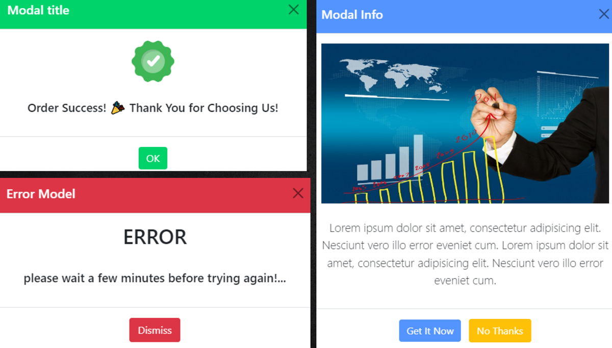
Introduction:
Bootstrap Modals are powerful components that add a layer of interactivity and engagement to web applications. As lightweight, customizable, and responsive elements, they serve as dynamic containers for content, allowing you to display information, forms, or even complex interactions without navigating away from the current page.
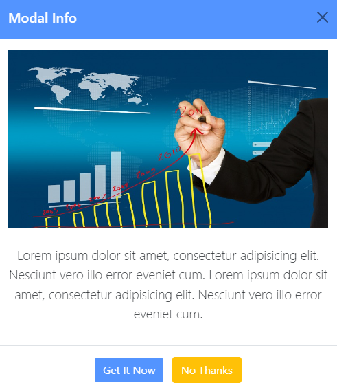
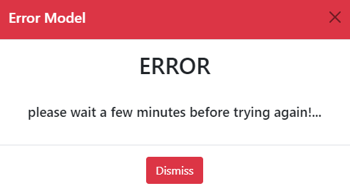
- You can use bootstrap models like simple alerts, success message alerts, multimedia presentations, etc.
- Bootstrap models are very easy to use and user-friendly.
Real Use Case fo bootstrap Confirmation Dialogs:
- When performing actions with significant consequences, such as deleting a user account or important data, create user account alert, delivery alert, modal popups can be used to confirm the action. This helps provides a layer of confirmation.
Some example of Confirmation Dialogs...
<!doctype html>
<html lang="en">
	<head>
	<meta charset="utf-8">
	<meta name="viewport" content="width=device-width, initial-scale=1">
	<meta name="description" content="">
	<meta name="author" content="">
	<meta name="generator" content="Hugo 0.84.0">
	<title>sample code</title>
	<!-- Bootstrap core CSS -->
<link href="css/bootstrap.min.css" rel="stylesheet">
	</head>
	<body>
<main class="container" style="text-align: center;margin-top: 9%;">
<!-- Button trigger modal -->
<button type="button" class="btn btn-primary" data-bs-toggle="modal" data-bs-target="#staticBackdrop" style="background-color:#01d36b;color: #ffffff;border: #01d36b;">
	Success Model
</button>
<!-- Modal -->
<div class="modal fade" id="staticBackdrop" data-bs-backdrop="static" data-bs-keyboard="false" tabindex="-1" aria-labelledby="staticBackdropLabel" aria-hidden="true">
	<div class="modal-dialog">
	<div class="modal-content">
		<div class="modal-header" style="background-color:#01d36b;color: #ffffff;">
		<h5 class="modal-title" id="staticBackdropLabel">Modal title</h5>
		<button type="button" class="btn-close" data-bs-dismiss="modal" aria-label="Close"></button>
		</div>
		<div class="modal-body">
		<img src="img/success.png" class="img-fluid" alt="success" style="height: 70px;">
		<br><br>
		<p style="font-size: 19px;font-weight: 500;">
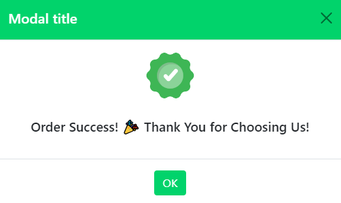
		Order Success! 🎉 Thank You for Choosing Us!
		</p>
		</div>
		<div class="modal-footer" style="    display: block;">
		<button type="button" class="btn btn-primary" style="background-color:#01d36b;color: #ffffff;border: #01d36b;" data-bs-dismiss="modal">OK</button>
		</div>
	</div>
	</div>
</div>
</main>
	<script type="text/javascript" src="js/bootstrap.min.js"></script>
	</body>
</html>
Preview...


Conclusion:
- Bootstrap modal popup alerts provide a sleek and effective way to communicate important messages or gather user input without navigating away. Bootstrap model is very simple and easy to use and very user user-friendly. you can use your web application and provide to good alert messages.